Задача: в рамках ребрендинга Томского госуниверситета разработать новый визуальный образ бренда.
Национальный исследовательский Томский государственный университет — первый российский университет на территории Русской Азии (фактически первый российский университет восточнее берегов Волги), один из трёх десятков национальных исследовательских университетов. Основание университету в Томске в составе 4 факультетов (историко-филологического, физико-математического, юридического и медицинского) было положено постановлением Государственного совета Российской империи от 16(28) мая 1878 года. Открылся Томский императорский университет в 1888 году.
7 июля 2013 года ТГУ вошёл в новый правительственный проект формирования особого списка-рейтинга ведущих университетов России и получил право на ещё одно дополнительное государственное финансирование программ прорыва в мировые рейтинги вузов. Цель правительственной программы — помочь сильнейшим вузам страны попасть в число топ-100 лучших вузов мира. В ноябре того же года ТГУ подтвердил свой статус и вошёл в список с 7 рейтинговым местом. Томский университет становится международным вузом. Новому статусу должна соответствовать и система визуальных коммуникаций бренда.
Команда «Провинции» начала работу над брендом в конце 2014 года, получив новый бренд-код от компании «Митрофанов и партнёры». За несколько месяцев мы провели презентации концепций стиля международному совету ТГУ, ректорату, административному совету. Затем прошли несколько общественных слушаний. Каждый раз вносились какие-то коррективы, решение оттачивалось, упрощалось, становилось универсальным. Итоговая презентация прошла в конце лета. В августе новая система активно внедрялась, чтобы 1 сентября студенты и преподаватели встретили с новым логотипом. Закончатся все работы к концу 2015 года, когда будут разработаны логотипы всех подразделений Университета.
Objective: design a new logo and corporate identity for Tomsk State University
National Research Tomsk State University (TSU) is the first Russian university founded in Russian Asia, i.e. in the territory on the East of the Volga river, and is one of the national research universities. It was founded by the State Council of the Russian Empire on May 28, 1878, and then opened in 1888. At that time it had only four departments: history and philology, mathematics and physics, law, and medicine.
On July 7, 2013, TSU took part in a new state project on creation of a list of the leading Russian universities, and TSU was entitled to an additional state sponsorship of the national program to get into the world’s rating of universities. The main goal of this program is to help the best Russian universities get into the top 100 best universities in the world. The same year, in November, TSU confirmed its status and ranked 7 in the list of the best national universities. Also, TSU has become an international university. The new status of the University demands the new brand.
Our team started the project at the end of 2014 when we got the brand code from Mitrofanov & Partners company. Within several months we gave presentations of the style concept to the International Council of TSU, the rectorate, the administration board. After that there were some public hearings. After each meeting we made amendments, made the solution simpler and more flexible. The final presentation was held at the end of this summer. And in August the new brand was implemented actively to be ready for the new school year. The project will be finished by the end of 2015 when the logos of all the departments are ready.
Томский университет — первый вуз в России за Уралом.
Tomsk University is the first higher education institution on the territory from the Urals to the Pacific Ocean.

Ранее у ТГУ было два логотипа: чертёж фасада главного корпуса и урезанная его версия. Основная проблема визуальной коммуникации — отсутствие единой системы для подразделений и сложность с масштабированием логотипа на разные носители. Кроме того, изображение главного корпуса в логотипе — самый распространённый ход среди российских вузов.
TSU used to have two logos: the detail drawing of the facade of the main building and its simpler version. With these logos it was hard to make consistent departments’ logos, and to adjust the logo for various media. Besides, it was too commonplace—most universities in Russia use their facades as logos.
TSU used to have two logos: the detail drawing of the facade of the main building and its simpler version. With these logos it was hard to make consistent departments’ logos, and to adjust the logo for various media. Besides, it was too commonplace—most universities in Russia use their facades as logos.

Университет меняется. Перед вузом поставлена серьёзная задача — занять место в сотне лучших вузов мира.
TSU is constantly changing. It has a serious challenge to meet—to become one of the 100 best universities in the world.

Новое видение бренда Университету разработала компания «Митрофанов и партнёры»
The new concept of the brand was made by Mitrofanov & Partners company.

Символы в новом логотипе: силуэт главного корпуса
Symbols used in the new logo: a silhouette of the main building.

Символы в новом логотипе: формы логотипов ведущих университетов Запада и Востока соединились в геральдический щит. ТГУ — евразийский университет.
Symbols used in the new logo: forms of the logos of the world’s famous universities were put together to make a coat of arms. TSU is a Eurasian university.

Символы в новом логотипе: U — первая буква латинских слов Universe (вселенная) и University (университет). Латынь — язык науки, понятный всему мировому сообществу. U — это «ты». U — это магнит, притягивающий интеллектуалов со всего мира учиться и работать в Томске
Symbols used in the new logo: the letter U, the first letter of the latin words “Universe” and “University”. Latin is the language of science. U also means “you”. U is also a magnet which attracts clever people from all over the world to study and work in Tomsk.

Символы в новом логотипе: университет основан в Томске в 1878 году
Symbols used in the new logo: the university is founded in 1878.
Symbols used in the new logo: the university is founded in 1878.

Цвет по-прежнему синий, но чуть светлее и ярче. Университет обновляется и стирает пыль веков.
We decided to leave the blue color, but we made it brighter and lighter. The University is constantly updating.
We decided to leave the blue color, but we made it brighter and lighter. The University is constantly updating.

Основная версия нового логотип ТГУ
This is the main version of the logo.

Логотип адаптируется к любому формату. Написание переводится на любой язык мира
The logo can be used in any format. The text can be translated into any language.

Три размерных варианта знака: детальный торжественный, походный и уменьшенный для миниатюрных носителей
There are three size variants of the logo: formal with all the details, informal, and small for small media of the corporate identity.
There are three size variants of the logo: formal with all the details, informal, and small for small media of the corporate identity.

Основной знак и написание легко преобразуются в знаки подразделений вуза: факультетов, институтов, лабораторий, проектов и даже спортивных команд.
The main symbol and the lettering can be easily transformed into symbols of the departments: faculties, institutes, labs, projects and even sports teams.

Сколько подразделений — столько и логотипов. И каждый в рамках единого стиля.
Now each department has its own logo. And all of them are made in one style.

Носители стиля: визитки
Media of the corporate identity: business cards
Media of the corporate identity: business cards

Носители стиля: бланки, папки, конверты, значки, карандаши
Media of the corporate identity: letterheads, folders, envelopes, pins, pencils
Media of the corporate identity: letterheads, folders, envelopes, pins, pencils

Носители стиля: сертификаты и грамоты
Media of the corporate identity: certificates and diplomas

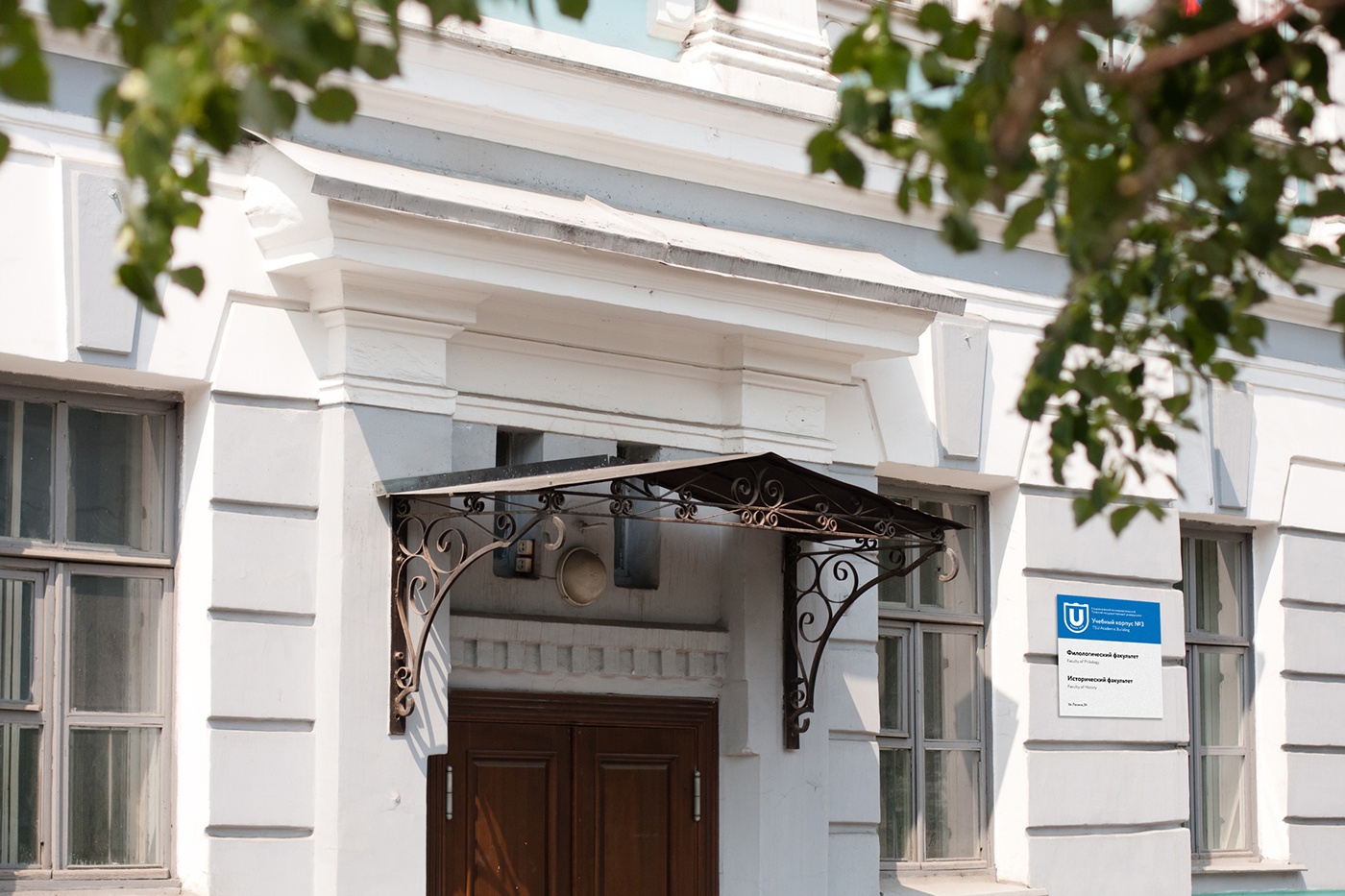
Носители стиля: навигация на корпусах ТГУ
Media of the corporate identity: entrance plaques for the University premises
Носители стиля: световые консоли на корпусах и общежитиях
Media of the corporate identity: illuminated signs on the walls of the University premises
Media of the corporate identity: illuminated signs on the walls of the University premises

Носители стиля: социальные сети
Media of the corporate identity: social networks
Media of the corporate identity: social networks

Носители стиля: подарочные футболки. Я люблю тебя, ТГУ
Media of the corporate identity: gift T-shirts. I love you, TSU.
Media of the corporate identity: gift T-shirts. I love you, TSU.

Носители стиля: спортивная одежда
Media of the corporate identity: sportswear
Media of the corporate identity: sportswear

Абитуриенты первыми познакомились с новым визуальным стилем
Applicants will be the first to meet the new look of the brand.

Ректор ТГУ Эдуард Галажинский и неизвестный студент с лотереей.
President of TSU, Eduard Galazhinsky, with a student who won a lottery.

ТГУ, в добрый путь!
Good luck, TSU!
Good luck, TSU!

Было — Стало
Before and after
Благодарим руководство Университета и всю команду, работавшую со стороны ТГУ. Отдельная благодарность за всестороннюю помощь Юлии Эмер. О процессе работы можно почитать в блоге.
We want to thank the University authorities and the whole TSU team for their help in the project. A special thanks to Julia Emer for comprehensive assistance! You can learn more about the project in the blog.
We want to thank the University authorities and the whole TSU team for their help in the project. A special thanks to Julia Emer for comprehensive assistance! You can learn more about the project in the blog.


